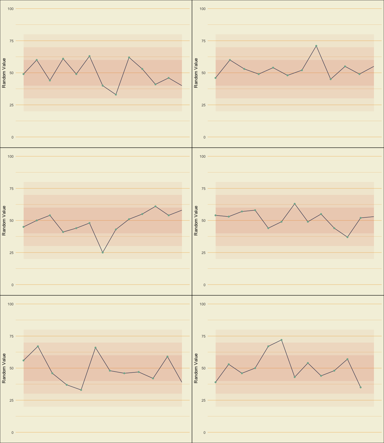
As a part of my PhD research, we conducted two empirical experiments testing visualization design for time series to be used in situated monitoring contexts, such as hospitals, manufacturing, or power production, where the subject of monitoring is close by. In these kinds of situations, visualizations need to both represent historical traces and (potentially) emphasize a current value. These visualizations may also need to represent whether the values are inside or outside a threshold (such as a heart rate being too high or too low). These combinations make the ideal design non-trivial, and so we ran initial experiments using static images as test cases in a simplified environment.
Results across tasks were mixed, but generally, participants preferred redundant encodings and size-based emphasis. For thresholds, participants vastly preferred the color indicators, and performance was better for these categories as well, particularly for points on the margins.

